Why shape comes first
At small sizes and at a distance, a logo is a silhouette. The silhouette sets the tone before any detail is visible, which is why shape decisions are made at the start of a brand project and why a mark that only works large is a weak mark.
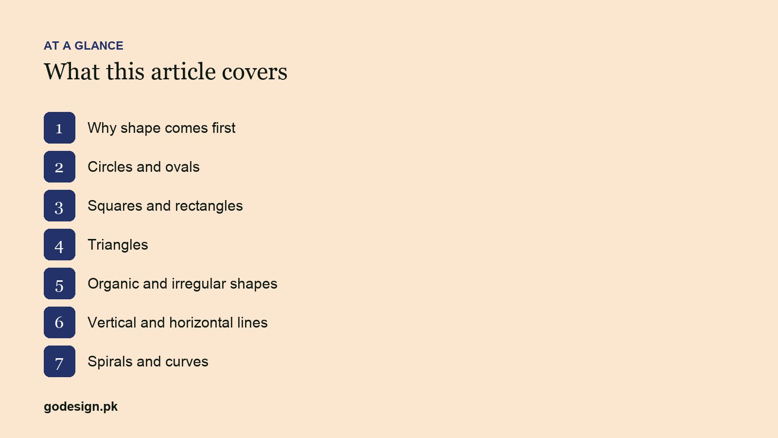
1. Circles and ovals
Unity, community, continuity, protection. No corners, so nothing to snag on; naturally fits badges, seals and social avatars. Very common, so a circular mark needs a distinctive interior to stand out.
2. Squares and rectangles
Stability, order, reliability. The shape of a building block and a screen. Suits finance, construction, technology and anything that wants to look dependable. Risk: rigidity; soften with rounded corners or a lively wordmark.
3. Triangles
Direction, energy, growth (pointing up), or tension and caution (pointing down). Strong in tech, sport, logistics and energy. Harder to fit into square spaces; plan the clear space around it.
4. Organic and irregular shapes
Natural, human, approachable. Leaves, waves, hand-drawn forms. Suit food, wellness, crafts and anything positioning against corporate competitors. Need careful simplification to survive small sizes.
5. Vertical and horizontal lines
Vertical reads as strength and aspiration; horizontal as calm and speed. Line-based marks are minimal and scale well, and they often double as patterns for stationery and packaging.
6. Spirals and curves
Movement, transformation, creativity. Common in wellness, education and creative brands. Can look dated if the curve is too swooshy; keep it geometric.
| Shape | Tends to signal | Watch for |
|---|---|---|
| Circle | Unity, trust | Sameness |
| Square | Stability, order | Rigidity |
| Triangle | Energy, direction | Awkward fit |
| Organic | Natural, human | Detail loss at small sizes |
| Lines | Strength or speed | Blandness |
| Spiral | Movement, change | Dated swooshes |
Common questions
- Which logo shape is most versatile?
- A compact mark that fits a square, such as a circle or a squarish monogram, paired with a horizontal wordmark for headers. That two-part system covers every placement.
- Do logo shapes really affect how people feel about a brand?
- At the margin, yes: shape sets a first impression before the name is read. It does not override the product or the price, but a shape that contradicts the brand's positioning creates friction.
- Should a logo be a shape or just a wordmark?
- Wordmarks are enough for many businesses and easier to make distinctive. Add a symbol when the logo must work very small, such as an app icon, or when the name is long.