
1. Start with the size it will be used at
Decide the target size before drawing. A 24px UI icon and a 96px feature icon are different drawings, not one drawing scaled. Detail that reads at 96px turns to mud at 24px. Draw on a canvas at the smallest target size, then scale up and add detail if a larger version is needed.
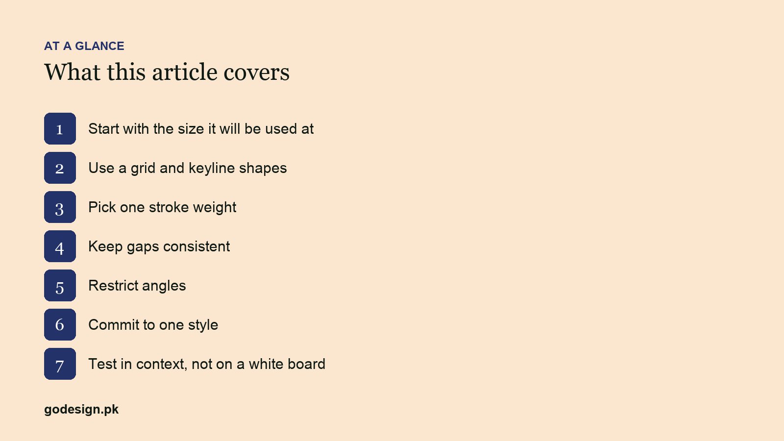
2. Use a grid and keyline shapes
A 24px grid with a 2px padding, plus a set of keyline shapes (circle, square, tall and wide rectangles) that all occupy the same visual weight. Material Design's icon grid is the reference most teams copy. Keylines are why a round icon and a square icon in the same set look equally sized: the circle is drawn slightly larger to match the square's optical mass.
3. Pick one stroke weight
Outline icons live or die on stroke consistency. A 2px stroke at 24px is the common default; 1.5px reads lighter and more editorial. Whichever you choose, every icon in the set uses it, including inner details. Mixed weights are the fastest way to make a set look assembled from three sources.
4. Keep gaps consistent
The space between strokes matters as much as the strokes. At small sizes gaps under 2px fill in. Set a minimum gap equal to the stroke weight and hold it across the set. Where a shape needs a thinner gap, simplify the shape instead.
5. Restrict angles
Use 45° and 90°, and 30° or 60° only when the whole set does. Odd angles blur at small sizes because they do not sit on pixels. Snap anchor points to whole or half pixels for the same reason.
6. Commit to one style
Outline, filled, duotone or flat colour. Corner radius sharp or rounded. Terminals square or round. Write these decisions down before icon two, because by icon forty you will have forgotten. This is the same discipline as a brand guide, covered in brand identity systems.
7. Test in context, not on a white board
Drop the icons into the actual interface at actual size, next to text, on the real background colours, on a phone. Icons that looked balanced on an artboard often need their optical centre nudged once they sit beside a label. Check in dark mode too.
Common questions
- What size should UI icons be designed at?
- 24px is the standard base for interface icons, with 16px and 20px variants for dense UI and 32px or 48px for feature icons. Design each variant deliberately rather than scaling one drawing.
- Should icons be outline or filled?
- Either, consistently. Outline icons suit lighter, editorial interfaces; filled icons read faster at very small sizes and in navigation. Many systems use outline by default and filled for the active state.
- Which tool is best for icon design?
- Figma for UI icon sets because of components and pixel snapping; Illustrator for icons headed to print or for complex vector work. Both export clean SVG.