
Logos serve as the graphical representation of a brand. They are the key identification feature of the company or brand. Logo fonts can make or break your logo designs. If you choose the right type of fonts, then it will help you to tell your brand story and amplify the impact of your logo on your audience. But, at the same time, choosing the wrong font can cause a lot of trouble. Most of the logo designers agree that you have to pay very close attention to the typography that you use while making your brand’s logo.
“For both your logo and your brand’s identity, the best fonts you choose to express who you are as a brand.”
While describing your brand personality, the most important element, apart from color and shape, is font. This is the reason that modern brands are very particular about the fonts they choose. There are various types of best fonts that you can use in your logo. In this article, we’ve put together the top ten notable and inspiring logos best fonts of all the time. They can be changed in a number of ways to give your brand a unique and extraordinary feel. It is very important to use the right font, so you have to spend some time selecting the perfect one for your brand. To see the best fonts in use and graphical elements in logo designs, check our showcase.
How to select the best logo fonts
- First of all, you have to look at what is your brand personality.
- Secondly, decide which font evokes the same feelings and ideas you are going for.
There are different types of fonts you can choose for your brand. You can either choose one or mix two or three different fonts because each font tells a different brand story. But you should try to avoid using more than two because it will make your logo look too busy and inconsistent. Choose one font for your brand’s name and another for your tagline or brand description. For example, if you are looking for a modern style, then choose sans serif. If you want to go for a classical or traditional one, then serif fonts will be best for your logo.
10 Best Fonts for your Logo Design:
This is a list of all those ten creative and top-notch best fonts.
1. Bodoni:
Bodoni is a serif typeface originally designed by Giambattista Bodoni in 1798. The early version of this font style was considered transitional but the later versions are considered modern in their category. This font style is known for its extreme contrast between thick and thin strokes. These strokes can make it more suitable for a display face rather than a text face. To speak more specifically, Bodoni is a typeface underlying structure with flat, un-bracketed serifs, and overall geometric construction.
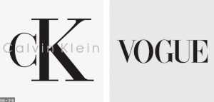
Massimo Vignelli says: “Bodoni is one of the most elegant typefaces ever designed”. Bodoni took the experiment by creating this dramatic font. This font style was used by famous brands for their logos like Vogue and Calvin Klein. It is also considered best for fashion brands.
2. Choplin:
Choplin is the font style that is based on the unconventional Campton font family. It is a geometric slab serif by German type designer Rene Bieder. This font family is ideally fitted for photography layout programs covering a wide range from editorial, company, web, interaction to product layout. Choplin is a good font to consider for more assertive branding. Moreover, this font has an extended variety of alternative glyphs, open-type, or ligatures features which gives flexibility and specialty wherever needed.
3. Garamond:
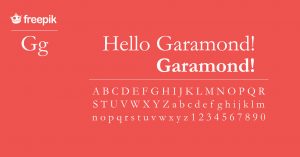
Garamond is the umbrella term for best fonts rather than a single typeface. Types of repetition that we see in recent decades are basically interpretations of alphabets designed by Claude Garamond and Jean Jannon in the 16th century. It is one of the first famous font styles which was presented at the Paris World’s Fair in 1990. Later on, several changes are made to this. The appearance of Garamond is quite elegant. The serifs on each letter are crafted so carefully that it describes its personality. As you know, serifs are so expressive that they can be easily used in a playful context- as already seen in the branding of Apple. Moreover, they are particularly used for printing body texts and books.
4. Didot:
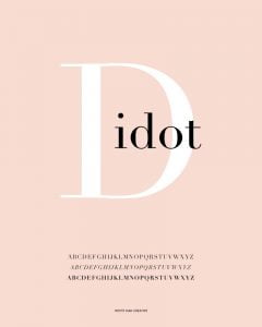
Didot is a group of typefaces that were named after the famous French printing, punch cutters, and type producing Didot family in the late 1700s. Firmin Didot cut the letters and cast them as types in Paris. It is characterized by increased stroke contrast, vertical stress, and flat, un-bracketed serifs. It is considered as a neoclassical serif typeface. Dodoni’s family created different versions of the fonts, one of which is used in the Giorgio Armani logo. This typeface has high contrast in line thickness is contemporary to similar faces developed by Bodoni in Italy. This font is very famous in the world of fashion. They are best when used simply with careful kerning and high contrast colors. You should consider this best font for a less dramatic fashion logo or in other words a logo that is mature and classy.
5. Modesto:
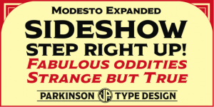
Modesto is a kind of loose-knit family based on a sign-painters lettering style popular in the late 19th and early 20th centuries. It was designed by Jim Parkinson from Parkinson Type Design. It duplicates the analog forms and then perfects them into a proper usable type family containing 23 fonts. It was not planned properly. It just happened with a few best fonts at a time over about fifteen years. It is used for Ringling Bros. and Barnum & Bailey Circus Logo. If you feel motivated and inspired by the vintage circus styles, classic wooden crate branding, or any cigar box designs, then you should opt for Modesto for your business.
6. Winston:
Winston was designed by Josh Carnley and published by Carnley Design Co. it is similar to a simple sans-serif. The slabs are often bracketed and are of different width from the letterforms. It is considered similar to that of Baltica. However, the main difference between both of them is that Baltica fits the criteria of slab serif while it falls under the category of sans-serif. This quality gives it a signature look that helps to define the brand like Winston. If you want your brand’s logo to be seen as trustworthy, or classic, or having old fashioned values, you should definitely go for this one.
7. Helvetica:
Original Helvetica is the most ubiquitous font ever, especially when it comes to branding. It gained popularity from the 70s and 80s when it was licensed to Xerox, Adobe, and Apple. From this, Helvetica gained international fame. The reason for this fame is that it is so simple and kind of utilitarian typeface. You should consider this font for a try and true appearance that feels familiar to new customers and seasoned design observers alike.
8. Neo Sans:

Neo sans has become standard for sans serif typefaces with a curved corner. It is the only typeface of its kind that is used in a sophisticated and subtle way. It creates friendlier energy and at the same time decreases the intensity of the font. This font was used by Intel. So, if you want to send an approachable, friendly vibe that is collected, calm, clear, and organized at the same time.
Picture
9. Yeshiva One:
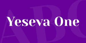
Architectural, high contrast, and eliciting a particular kind of distinct, feminine essence, designer Jovanny Lemonad created Yeseva One as a serif display of “a complete agreement between a man and a woman”. As it is obvious that it is named after the phrase Yes, Eva, you can clearly see the friendly atmosphere created by it. It works well with Roboto, Open Sans, and other balanced serifs. Choose this logo font if you want to communicate a conservative, agreeable, and graceful approach.
10. Walk-On:

Walk On typeface was originally designed by Hanson Chan. It was designed for the fashion brand, Wang & Lynch. He tries to create a font style that deeply inspired him to have Art Deco’s straight lines and bold shapes and Art Nouveau’s organic aesthetics. It includes simple shapes and ornamentations for its application. You want a nostalgic and decorative spin for a lifestyle-focused brand, then without a doubt follow the Walk On typeface.
Now, you have got a much clearer idea of the variety of best fonts that are used in logos. It is easy for you to find a perfect logo font for your brand. Some people might not like the above-mentioned best fonts but they are the most popular fonts used by various brands. You should just strive to make the logo unique and characteristic by choosing the right typeface.


18 Responses
Very rapidly this web page will be famous among all blogging users, due to it’s good articles or reviews
It’s really a nice and useful piece of info. I am happy that you shared this helpful info with us. Please keep us up to date like this. Thank you for sharing.
A small apartment in a building without central air is an all-too-widespread state of affairs in New York.
This web site certainly has all of the info I needed about this subject and didn’t know who to ask.
Your style is unique in comparison to other folks I have read stuff from. Thank you for posting when you have the opportunity, Guess I will just bookmark this page.
You can change your consent settings at any time by unsubscribing or as detailed in our terms.
I think everything published was actually very reasonable. But, what about this? what if you were to write a awesome title? I ain’t saying your content isn’t solid, but what if you added something that makes people want more? I mean 10 Best Fonts to Use for Logo Design is a little plain. You could peek at Yahoo’s home page and watch how they create news headlines to grab viewers interested. You might add a related video or a pic or two to grab readers excited about everything’ve got to say. Just my opinion, it would bring your posts a little bit more interesting.
I have read so many articles or reviews on the topic of the blogger
lovers except this article is actually a pleasant article, keep it
up.
Amazing blog! Do you have any recommendations for aspiring writers? I’m hoping to start my own blog soon but I’m a little lost on everything. Would you recommend starting with a free platform like WordPress or go for a paid option? There are so many choices out there that I’m totally overwhelmed .. Any tips? Thanks a lot!
But wanna say that this is very helpful, Thanks for taking your time to write this.
I’m impressed, I have to admit. Seldom do I encounter a
blog that’s equally educative and amusing, and
let me tell you, you have hit the nail on the head.
The issue is an issue that too few people are speaking intelligently
about. I am very happy that I found this during my search for something concerning this.
It’s nearly impossible to find experienced people in this particular topic, however, you seem like you know what you’re talking about! Thanks
This article offers clear idea in support of the new users of blogging, that truly how to do blogging.
Video is not clear.Show the question first properly.
I am genuinely grateful to the holder of this site who has shared this great article at
at this time.
Excellent goods from you, man. I have remember your stuff prior to and you’re just extremely excellent.
I really like what you have received right here,
certainly like what you are stating and the way by which you say it.
You make it entertaining and you still take care of to
keep it sensible. I can not wait to read far more from you.
This is really a wonderful website.
Great blog really useful information regarding logo typefaces. Really impressed by the Badoni font. It has the perfect and stylish texture style looking forward to utilizing it in my designs and projects. Really appreciate it keep up the good work.