A glance at the concept of a generic logo!
Have you ever seen a logo for a brand and got no feeling of originality in it? Have you felt like you had seen the same logo standing for some other company? You might have had a glance at the overused logos that are typically named generic logo designs. They are the cliched designs that continue to appear in an industry over and over again. They lose the characteristic novelty in their concepts. Even if the idea behind the logo comes up with some original features, they don’t instill any originality in the design.
Logos are not confined to only images or text rather they stand as the clear face of a brand. They signal either originality or unoriginality to their customers depending on the nature of their designs. Brands are always in search of such logos that make them stand out from the other top-tier companies. The logos that always denote compelling messages to the world are the prime choice of the brands.
“Design is the silent ambassador of your brand.”— Paul Rand
In the vast domain of the creative community, the customer sets up their projects (for websites, logos, etc.) and designers come on the surface to respond with their fine proposals. The customers and designers have the golden opportunity of formulating creative works and make marks in the business community.
“There are three responses to a piece of design – yes, no, and WOW! Wow is the one to aim for.” — Milton Glaser.
But what acts as a stumbling block? It’s a generic logo that acts as a tricky trap in the jungle of logo design. Most of the time, the logo acquires so many generic features that the customer fails to get a trademark for it. With a generic logo, a company gives a distorted image of itself to the market. The company’s identity is lost because of its anonymous image. The overused logotypes hinder the progress of the brand in the market. In this way, they venture on the antagonistic path than to stand different from others (which is the prime function of a logo).
Some of the generic logos are quite easy to spot while others may get unnoticed. It depends on how trained your eye is!!! You don’t need to fret! The following are some of the generic logo concepts so you can get an ample idea about how to spot and avoid them.
1. V-man concept:
The V-human concept with the accompanying characteristic of being “No-gender humanoid”, has been used among various brands, from the sphere of business to social media zones. It holds a great theoretical stance behind its front image i.e. all customers are primarily humans and the best customers are those who get enthusiastic about your brand. But what’s the downside of this V-man logo??? It is the lack of originality in this logo that gives it the title of being the generic logo.

The V-man comes in different types. It either travels alone or in a group. It also comes up in the shape of a ring.
2. Globe logos:
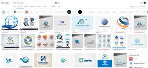
Globe logos have been used excessively in the logo world. It is just like a tale as old as time. Companies get hold of the globe logos to signal themselves as marketing on the global level. But the results are contrary i.e. they create an impression of being outdated by using such a cliched logo. This logo is so overused that it doesn’t instill any freshness or originality anymore.
3. Graph logos:
A general concept about the graph is that it points towards success if it goes up and to the right. A graph logo is such a common concept that it doesn’t bring any newness to the meaning. It has lost all this impression. It doesn’t show anything special about your brand.

4. Wordmarks and letter marks:
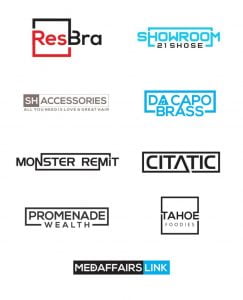
In the race of sign logos, wordmarks and letter marks serve to be a unique way of branding your business. But some of them have been used several times and they have completely lost their specialty and uniqueness. Wordmarks and letter marks that don’t say anything about your business have become Generic.
5. Generic logo-unique to specific industries:
Besides the above-mentioned concepts about a generic logo, there are plenty of common concepts that are idiosyncratic to specific industries. Do you want to stick out from your competitors? If yes! Then I have got a collection of logos that you need to avoid for the successful marketing of your brand.
· Accounting & Finance:
The most common practice in the finance industry is to design logos in a geometric shape. Along with it, the initials of the company are always chosen to make it stand out in the logos.
· Real estate:
The logos designed for denoting real estate are particularly common. They come up in shapes like rooflines, buildings, or even a skyline. By looking at such logos, one can directly hit upon the idea of real estate brands. No wandering of ideas clearly the real estate brand!!!
· Communications and technology:
The common images in this industry are a lot of globes, lines, and several arrows. They denote global relation, connectivity, and computer operation respectively. The technological industries tend to use these types of logos to portray their incorporeal business but unfortunately, they mark themselves as the common entities.
· Merchandise:
The most commonly used logos in the retail zone are money, carts, and price tags. They don’t feature anything unique. These are the images that stand as the overused retail logos.

· Health and medicine:
Some several concepts and signs have been universally acknowledged in the field of health and medicine. These specific signs easily denote the type of business. These logos never allow anyone to face problems while trying to recognize the field. But there is a flaw attached to something universal i.e. it is so overused and lucid that it can never stand out.
· Dental:
“Back and forth and in and out. My tooth moved all about. Wiggly, wobbly, wiggly, wobbly. Hey! My tooth fell out!”- Grade 1 students are so obsessed with this poem 😊
As dentistry is all about teeth, a generic dental logo comes up with an image of a tooth. The tooth is either in a simple form or it is some other effects to it like placing it in a circular shape.

· Automobiles:
Generic automobile logos usually utilize emblems to denote their brands. Most of the time, the emblems are within circular shapes and present numerous wings. Besides this, abstract car shapes are also used in automotive logos. These images are so common that one doesn’t get any exceptional feeling by looking at them.
· Environmental:
The environment includes the earth, water, trees, and many more elements. So, these images are commonly featured in environmental logos. No surprising element is present in these images rather they form the category of most cliched environmental logos.


6. Is your industry different from the above-mentioned categories?
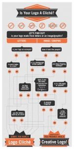
If you find your industry not fitting into any of the above-mentioned categories, you can do a Google Image search for your industry type and its logos. Numerous images would pop up on your screen. A quick scroll down the page will enable you to check out the overused logo designs among your opponents.
Simple Hacks for creating a distinctive logo:
Marketing your business is not an as easy job. It holds its own hard and fast rules. Nothing is more constructive than exploring the Do and Don’ts of your business. To make your brand highly extraordinary, you need to put some effort into creating an appealing logo for it. Let’s have a look at some of the hacks for creating a distinctive logo.
Keep it plain but eccentric!
The logo that is not overly adorned yet conveys the message clearly is generally regarded as the GOOD LOGO. Instead of using common shapes, always go for something unique and peculiar. You can even deviate from the concept of using shapes by expressing the elementary qualities that the brand wants to express.
If you want to use the same logos, try to add a new touch to them. Don’t wield them in the same overused way. Modify them and it will help you to signal the good marketing features of your brand. If your brand holds the tag of customer service, then you can reuse the above-mentioned V-man. Try to keep aside the overused humanoid form of V-man and mold it in some peculiar form. Your brand will witness some amazing results.
Add touches of your unique story into the logo:
Hoping to make your logo stand out from other competitors, you need to add certain distinctive details about your brand to it. This will enable your logo to emphasize the design as well as the mission statement of your business. The generic logo style will exert no influence on your innovative logo.
For example, “I own a bakery” won’t attract the customers as much as “I own a bakery that was opened by my uncle in the 1990s and it retains its super vintage look and exquisite sugary taste.” You can give a minor account of the brand story while designing a logo. It will instill winsome characteristics to your logo.
You can even create unique logos by sticking to common concepts. You just need to find a key feature of your brand and transform it into some emblem or visual image. Breathe a new life into conventional logos!
Pass your logos through the scroll test:
As a logo is a key force to attract any customer, it should be instilled with certain persuasive features that allow the client to give a prolonged look to it. Think of some logos in your brand and put them into Google Image search. Bundles of logos would appear on the screen stacked upon each other. How would you find the best logo in so little time? Notice some of the elements that are attractive enough to please your customers. Learn from such features and try to use them in the designing of other logos.
Just make sure your logo holds all the essential ingredients that can force the people to reflect. A good logo should not spread aesthetic vibes only, but it should also lay the foundations for your news business. Always design such a logo that can stand out in a crowded business sphere.
The brand logo gives voice to your aims and expressions!!!
Your brand needs its first win on the level of logo designing. Logos speak up your aims and targets. They are the rudimentary ingredients of your business ventures. Try to put your maximum effort and skills into logo designing. Don’t go after trash generic logo designs when you can configure your wonderful concepts. Once you are done with your unique logo designs, you can take your business to another level!

