1. Keep it simple
The strongest logos are one idea, drawn cleanly. Simplicity is what lets a mark work at 16 pixels, in one colour, embroidered on a shirt. Every added element is a reason it will fail somewhere.
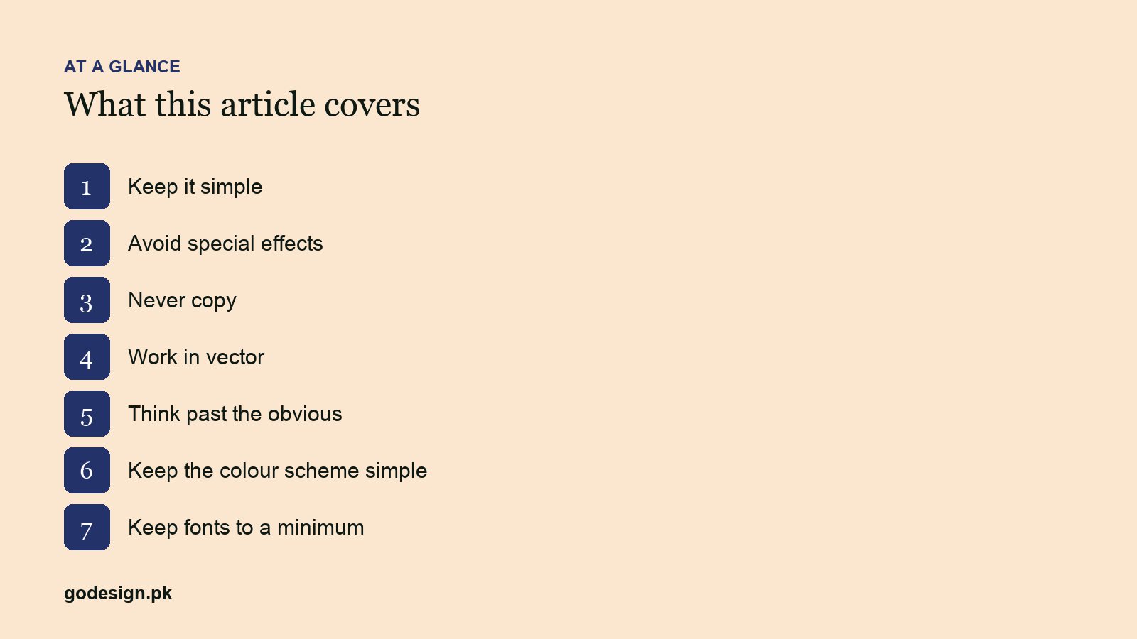
2. Avoid special effects
Gradients, drop shadows, bevels and glows date a logo instantly and break in print, embroidery and single-colour uses. Design the flat version first. If a gradient is part of the brand, it is a secondary treatment, not the logo.
3. Never copy
Stock icons, traced marks and near-copies of famous logos are legal risk and brand poison. Research what exists in the category, then deliberately go elsewhere. Checking for copies is part of the process, both ways.
4. Work in vector
Illustrator or a vector tool from the first sketch to the final file. Vectors scale from favicon to billboard without loss and are what printers, sign-makers and developers need. A logo delivered only as PNG is unfinished.
5. Think past the obvious
The first idea for a coffee brand is a bean; for a dentist, a tooth. So is everyone else's. Write twenty ideas, discard the first ten, and look for the one that says something about this business rather than the category. The generic logos piece lists the clichés to skip.
6. Keep the colour scheme simple
One or two colours, chosen with the brand palette in mind, and a version that works in black. Colour is applied after the form is right, never to rescue a weak form.
7. Keep fonts to a minimum
One typeface, two at the most. Choose for legibility at small sizes and for character that matches the brand; see fonts for logo design. Adjust the kerning by hand; default spacing is never right in a wordmark.
8. Consider custom letterforms
Modifying a typeface, or drawing the letters, is what makes a wordmark unmistakably yours and avoids licensing limits on logo use. The rebranded project moved from a purchased font to customised letterforms for exactly that reason.
Common questions
- How many concepts should a logo designer show?
- Two or three well-developed directions beat ten rough ones. The client's job is to choose a direction; the designer's is to have already discarded the weak ideas.
- Should a logo have a symbol or just text?
- Many strong brands are wordmarks alone. Add a symbol when the name is long, when the mark must work as an app icon or favicon, or when the symbol carries meaning the name does not.
- What files should I get with my logo?
- Vector source (AI, SVG, PDF), PNG on transparent background at several sizes, versions for light and dark backgrounds, a single-colour version, and the colour and font specifications.