
Mobile friendly website for Pakistani businesses: what it means and where it breaks
A mobile friendly website is one a visitor can read, navigate and act on with one thumb, without pinching, zooming or hunting for the button. It breaks in ordinary places: a desktop menu squeezed into a phone screen, a form with fields that sit under the keyboard, a banner image that pushes the headline off the first screen.
Many visitors in Islamabad, Lahore and Karachi reach a business through a phone, from a social post, a WhatsApp forward, a search result or an ad. That is a general observation, not a figure, but it changes how a site should be planned. The phone is the main screen, and the desktop version is the one that gets adapted.
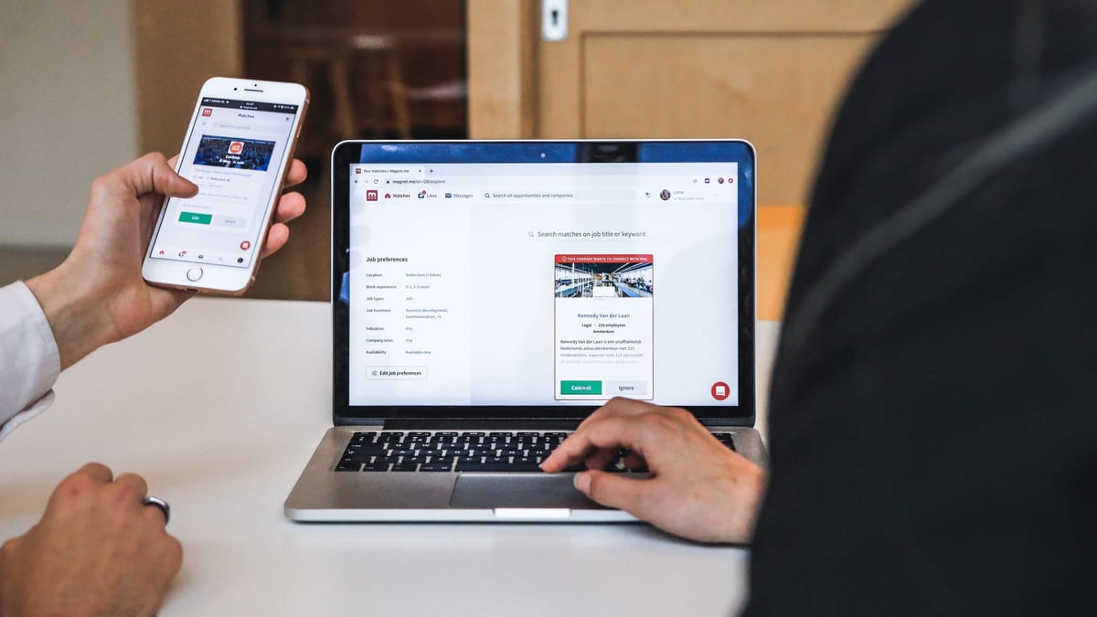
Owners rarely see the damage, because a visitor who struggles does not complain. They leave. If your website looks fine on your own laptop and quiet in your enquiries, check it on a phone before you blame the ad.
Mobile responsive design: themes, builders and custom code
A mobile responsive website adjusts its layout to the screen it is shown on, so one site serves a phone, a tablet and a desktop. How well it does that depends far less on the label "responsive" than on how the pages were designed and built.
We say plainly what we build on. Our services page describes company sites, landing pages and web applications designed in Figma and built on WordPress, Shopify or a custom React and Next.js stack. Our WordPress work uses Elementor, Kadence and custom themes. For custom projects we design the mobile view first and agree the layout in a clickable prototype before code is written, which is what mobile first means in practice.
A ready-made theme is a fair starting point for many businesses, but a theme that looks good in its demo can fall apart once your real logo, long product names and real copy go in, which is why we design with your content in mind.
If you are choosing a platform, our guide to choosing a WordPress theme covers the theme side, and our article on e-commerce website design covers store layouts.
For a candid example, our Paradigm Design & Construct case study is a WordPress website built with Elementor for a construction company in Islamabad. Our work included responsive design and speed optimisation, and the case study shows mobile screens. We do not publish results for it, only what we built.
If your site needs to work on phones from day one, get a custom quote and tell us what the site has to do.
“The layout is clean, user-friendly, and visually appealing. She captured our brand perfectly and was responsive throughout the process. Great work!”
That was a Shopify store job, not a mobile friendly project. We include it because it shows a client who wanted a clean, easy-to-use layout and got one.
Mobile friendly speed and performance on Pakistani networks
A mobile friendly site also has to load quickly, because a layout that fits but takes ages to appear still loses the visitor. Phones on a patchy connection feel every extra kilobyte, so speed is part of the design, not a polish step at the end.
The usual causes are general and well known. Large photographs uploaded straight from a camera, too many plugins or apps, heavy fonts, sliders and video that start loading before anyone asks for them, and cheap hosting that answers slowly. Most of that is decided at the build stage, which is why it is cheaper to plan for than to repair.
Our services page says we build WordPress sites to pass Core Web Vitals and fix slow pages when we move a site off an old theme. We do not promise a particular score, because it depends on your content, hosting and plugins. If hosting is part of the problem, our guide to cheap WordPress hosting providers is a place to start.
Speed and search are linked in practice, and our SEO work in Islamabad includes checking mobile issues as part of a technical audit. We do not promise rankings.
Mobile friendly forms, checkout, WhatsApp and call buttons
On a phone, the enquiry has to be easy to start and impossible to miss. That means a phone number that dials when tapped, a WhatsApp button where your customers expect one, and a form short enough to finish with a thumb.
- Forms: few fields, the right keyboard for each one, clear error messages, and a confirmation that tells the visitor it worked.
- Checkout: for WooCommerce and Shopify stores, a short path from product to payment, with local and international payment options set up to suit your market.
- Product pages: images that fit the screen, buttons within reach of a thumb, and prices and delivery details near the top.
- Ad landing pages: one clear message and one action on the first screen, because the visitor arrived from a single tap and will leave the same way.
- Booking and calls: a click-to-call link and a booking step that does not bounce the visitor between three pages.
Our services page says we build WooCommerce and Shopify stores with the checkout, payments and shipping rules set up, and landing pages are part of our website and advertising work. If you run paid campaigns, our article on campaign optimization explains how we trace where enquiries come from.
“She managed and completely this project quickly and accurately. I'll definitely work with her again.”
That was an SEO job, not a mobile friendly project, and we do not present it as one.
Working with a mobile friendly web design company in Pakistan
A good mobile friendly web design company checks the whole journey, not just the home page: the ad or post, the landing page, the form, the thank-you message and the reply. A freelancer who only supplies a theme leaves the gaps between those steps for you to find.
Designers, WordPress and React developers and SEO people work in the same Islamabad office, with one project manager and one invoice. You get a call within one working day, a 30-minute meeting with a partner, then a fixed quote. We do not publish prices, because they depend on the pages, features and stack.
If you are comparing teams, our lists of the best digital agencies in Pakistan and the best advertising and marketing agencies show how we see the market. If your forms need to feed a customer record, our CRM development article shows the next step.
Get a custom quote for your mobile friendly website
Tell us what the site is for, whether it is a company site, a store or a landing page for ads, and where your visitors come from. We reply within one working day with next steps, usually a short call and then a fixed quote.
[Get a custom quote](/contact/) from our Islamabad team, or book a free discovery call to talk it through first. We will say honestly what we recommend for your brief.
Sources
- This article contains no statistics or prices. The remark that many visitors in Pakistan browse on phones is a general observation, not a measured figure. The description of our WordPress, WooCommerce, Shopify, React and Next.js, Supabase and Laravel work, designing the mobile view first, and the reply within one working day, 30-minute call and fixed quote follows the GoDesign services, technologies and company pages on this site.
- The Paradigm Design & Construct description follows its case study on this site: a WordPress website built with Elementor for a construction company in Islamabad. The case study lists responsive design and speed optimisation among our contributions. It does not give mobile results and we make no claim about them.
- Google, WordPress, WooCommerce, Shopify, Elementor, WhatsApp, React and Next.js are third-party names used only to describe what we build with or what visitors use. GoDesign is not a partner, certified expert or affiliate of any of them.
- Both client reviews are excerpts of public reviews on Freelancer.com, trimmed only to remove the freelancer's name by dropping the opening sentence, and otherwise exactly as written. The first was left on a job called Shopify Store Development with Dropshipping Setup and the second on a job called SEO Optimization. Neither was a mobile friendly project. Neither excerpt contained a dash, so nothing was changed.
- The photographs are free-licence stock images and do not show GoDesign clients or results.
Common questions
- Do you build mobile friendly WordPress websites?
- Yes. WordPress is our most experienced stack, built on Elementor, Kadence and custom themes. For custom projects we design the mobile view first.
- Can an existing website be made mobile friendly without a full rebuild?
- Sometimes. If the theme is sound, the fixes can be local. If the layout or platform is the problem, a rebuild or migration is cleaner, and we say which after looking at the site.
- Do you build mobile friendly online stores and landing pages?
- We build WooCommerce and Shopify stores and landing pages, with checkout, payments and shipping rules set up. Share the store or campaign you have in mind and we will confirm the scope on a call.
- Will a mobile friendly website improve my Google ranking?
- We do not promise rankings. A site that is fast and easy to use on a phone gives search engines and visitors less to struggle with, and our SEO work covers mobile issues in a technical audit.
- How much does mobile friendly website development cost?
- We do not publish prices, because the cost depends on the pages, features and platform. Request a custom quote and we will scope it after a short call.