
Web design trends shift constantly, but the fundamentals of what makes a website effective don’t change much. Good websites are fast, clear and easy to navigate. The trends worth following are the ones that serve those fundamentals — not just visual novelty for its own sake.
Here are the web design trends that have staying power and practical application for businesses building or updating their sites.
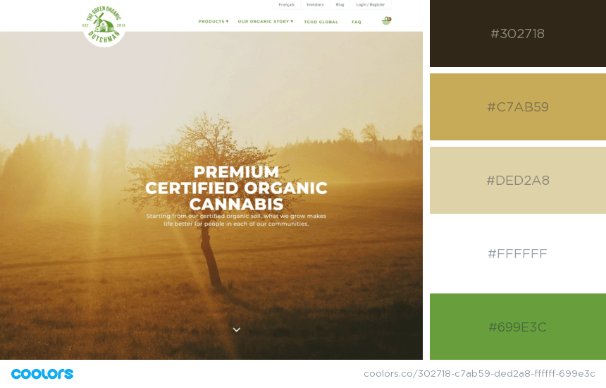
1. Comfortable, Low-Contrast Color Palettes
Designers have moved away from stark black-and-white extremes toward softer, warmer palettes — off-whites, warm creams, muted greens and dusty blues. The reason is practical: screens are where most people spend hours every day, and color palettes that are easier on the eyes create longer, more comfortable sessions.
This doesn’t mean dull. Strong brand accent colors still work well when used selectively against a calm background. For guidance on building a palette that works both for your brand and for users, see our post on how to pick a good color scheme for your website.
2. Parallax Scrolling
Parallax creates depth by moving foreground and background elements at different speeds as you scroll. Done well, it makes a page feel layered and immersive without being distracting. Done badly, it’s disorienting and slows the page down.
The key is restraint. Use parallax on one or two sections to create a moment of visual interest, not across the whole page.
3. Illustration and Abstract Art Instead of Stock Photography
Generic stock photography looks generic. Brands increasingly use custom illustration, abstract shapes and 2D flat art to differentiate their visual identity. Illustration is also more flexible — it can communicate abstract concepts that photography can’t.
If you’re building a brand identity and wondering how to use visuals effectively, read our post on brand colors of well-known brands for examples of strong visual thinking from companies that got it right.
4. Neumorphism and 3D Elements
Neumorphism uses soft shadows and highlights to make UI elements look like they’re extruded from the background — a blend of flat design and skeuomorphism. It works best for dashboards and apps, less so for marketing websites where clarity matters more than tactile feel.
3D elements and rendered objects are more broadly applicable — used well, they add visual weight and draw attention to key sections of a page.
5. Dark Mode Design
Dark mode has moved from an operating system preference to a mainstream design choice. For tech products, creative studios and entertainment brands, dark backgrounds feel premium and reduce eye strain in low-light environments.
If you’re designing for dark mode, your color palette needs to be reconsidered — colors that work on white often look completely different on dark backgrounds.
6. Minimalism With Strong Typography
Heavy reliance on images is giving way to typography-led layouts — large, expressive type as the hero element, with images playing a supporting role. This approach works especially well for agencies, personal brands and professional services businesses.
Good typography choices are part of brand identity. We cover this in our guide on the best fonts for logo design — many of the same principles apply to web typography.
7. Micro-Interactions
Micro-interactions are small animations that respond to user actions — a button that changes state on hover, a form field that highlights when active, a success animation after a form submission. They make interfaces feel responsive and alive without being distracting.
They’re also a UI/UX concept worth understanding in depth. Our UX/UI terminology guide covers the vocabulary designers use when talking about interactions like these.
8. Mobile-First, Performance-First Design
This isn’t really a trend — it’s a baseline requirement. Over 60% of web traffic globally comes from mobile devices. Google ranks mobile performance as a significant ranking factor. Designing for desktop first and adapting to mobile is backwards.
Performance goes hand in hand with this. Heavy image files, unoptimised code and cheap hosting all hurt your Core Web Vitals score and your search rankings. If you’re on WordPress, read our guide on the best affordable WordPress hosting providers — your host has a bigger impact on performance than most people realise.
Applying These Trends to Your Website
Not every trend is relevant to every business. A law firm doesn’t need parallax scrolling. A creative studio doesn’t need to look like a corporate brochure. The right design choices depend on your industry, your audience and what you’re trying to communicate.
If you’re rebuilding your site or starting from scratch, our web design and development services cover the full process from UI/UX design in Figma to development and launch. Get in touch if you’d like to discuss your project.
For more on the design and development process, also read:
- 7 e-commerce website design tips — if you’re building a store
- How to choose WordPress themes — if you’re building on WordPress
- 7 common UI design mistakes — what to avoid in the process
