What is the UX design process?
The UX design process is the sequence of steps a team follows to design a product around what users actually need, rather than around assumptions. Each step makes a decision with slightly more evidence than the one before, and each produces something the next step builds on: a brief, research notes, wireframes, a prototype, test findings.
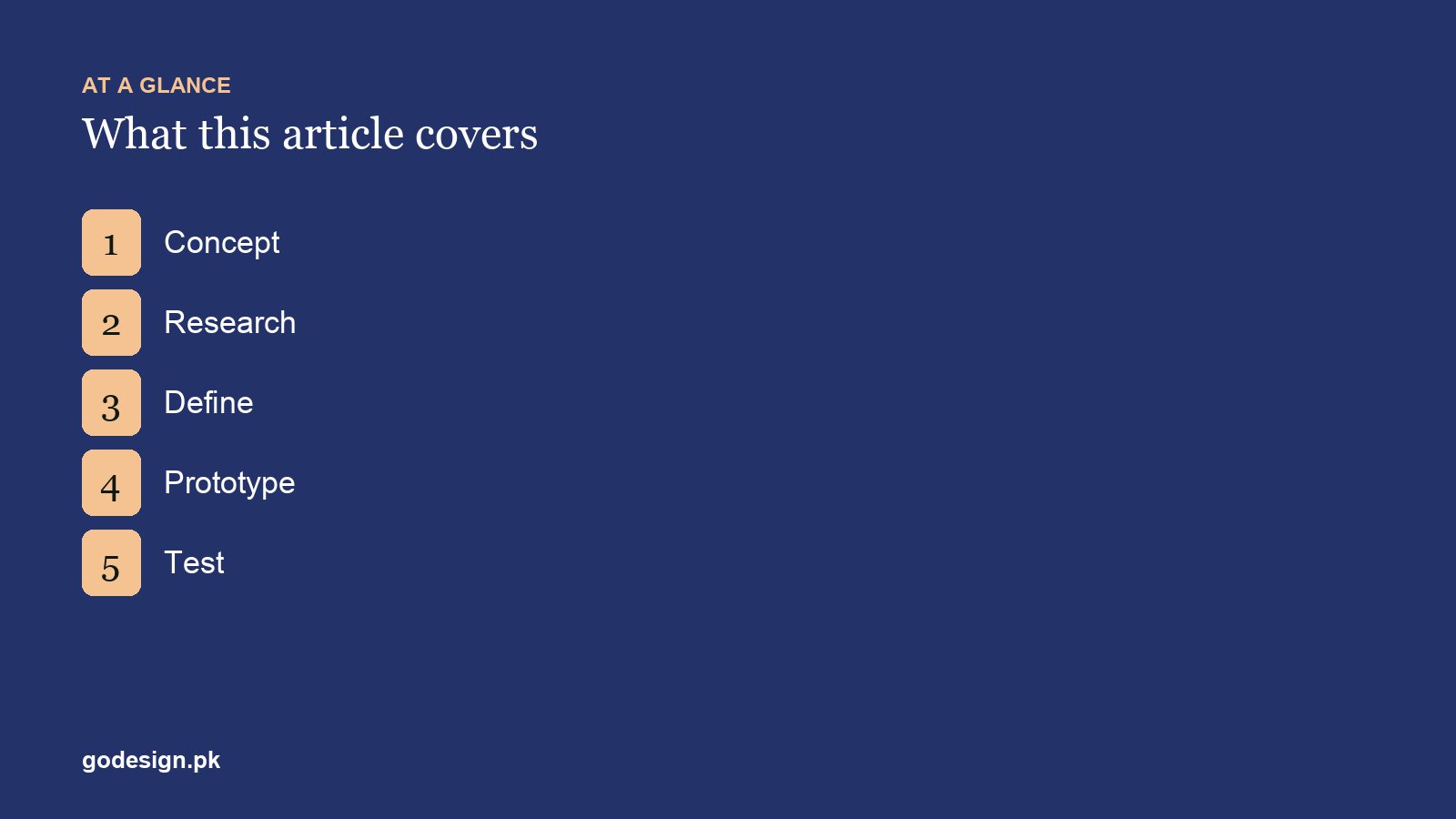
Most versions trace back to the UK Design Council's Double Diamond: first widen the problem (research), then narrow it (define), then widen the solutions (design and prototype), then narrow them (test and refine). The five steps below are the practical version for websites and web apps. The process loops: testing often sends you back to define or prototype, and that is the point.
1. Concept: agree what you are building and why
Write one page that answers four questions: what the product is for, who it serves, what the user should be able to do, and how you will know it worked (more enquiries, fewer support calls, more completed orders). Then sketch the main screens roughly, on paper or a whiteboard.
The goal is shared understanding between the client, the designer and the developer, not attractive pictures. Most projects that go wrong do so here, when two people agree on a brief that means different things to each of them.
Free tools: Google Docs for the brief; FigJam or Miro (both have limited free plans) for sketches and sticky-note sessions.
2. Research: learn how users behave today
Talk to five to eight people who match your intended users. Ask what they do today, what frustrates them and what would make them switch. Ask about past behaviour ("Tell me about the last time you...") rather than opinions about the future ("Would you use..."), because people are poor at predicting what they will do.
Then look at the evidence you already have. If a site exists, check Google Analytics 4 for where people arrive and where they leave, and read the questions customers ask in emails, WhatsApp and sales calls. Review three or four competitors with the same questions in mind: what do they make easy, and what do they hide?
Free tools: Google Forms for short surveys; a video call with the participant's permission and OBS Studio (free and open source) to record it; Google Sheets to tag what you heard; Google Analytics 4 and Search Console for existing traffic.
3. Define: turn findings into flows and wireframes
Turn the research into decisions. Write the main user flows (for example, landing page to service page to quote form), agree the information architecture (the menu and what sits on which page), and list every screen with what it must contain. Then wireframe those screens in grey boxes, deliberately without colour or fonts, so the review is about structure and order.
Get the wireframes signed off before visual design starts. Jumping straight to polished screens is one of the UI design mistakes that quietly cost you users, because people then debate colours while the structure goes unchecked.
Free tools: Figma's free Starter plan or Penpot (open source) for wireframes; FigJam or Whimsical for flows and sitemaps.
4. Prototype: make it clickable
Apply the visual design (type, colour, imagery, components) and link the screens so a person can click or tap through the main tasks. Design the mobile view first. A prototype only needs to be real enough to test the flow; it does not need every page or every state.
On client projects the prototype is what people comment on. The S-Line platform was worked through in a shared Figma file before development started, which is when changes are cheapest. If any of the vocabulary here is unfamiliar, our UI and UX terminology guide explains wireframe, mockup and prototype.
Free tools: Figma's prototyping features, which are enough for almost every website; Penpot also supports clickable prototypes.
5. Test: watch real people use it
Give five people a realistic task, such as "find out what a logo costs and ask for a quote", and watch without helping. Note where they hesitate, what they say and where they give up. Nielsen Norman Group's long-standing guidance is that around five users find most of the usability problems in a round, so it is better to fix and test again than to test once with a large group.
Testing does not stop at launch. Real traffic shows problems no prototype test will: a form field that confuses people, a page where mobile visitors leave. Check behaviour in the first weeks after launch and fix what you find.
Free tools: a video call for moderated tests; Maze or Lyssna for unmoderated tests (check the current free-plan limits); Microsoft Clarity for free heatmaps and session recordings after launch; Google Analytics 4 for engagement and conversions.
Free UI UX design tools for each step
| Step | Output | Free tools |
|---|---|---|
| Concept | One-page brief, rough sketches | Google Docs, FigJam, Miro |
| Research | Interview notes, analytics findings, competitor review | Google Forms, OBS Studio, Google Sheets, GA4, Search Console |
| Define | User flows, sitemap, wireframes | Figma (Starter), Penpot, FigJam, Whimsical |
| Prototype | Clickable, mobile-first design | Figma, Penpot |
| Test | Findings and fixes | Video call, Maze, Lyssna, Microsoft Clarity, GA4 |
Free plans change often and usually limit the number of files, boards or test responses. For one project at a time they are enough; teams running several projects at once tend to move to paid seats.
How long does the UX design process take?
It depends on the size of the product, not the number of steps. On a typical business website we plan concept and research for the first week, define for the second, prototype over the third and fourth, and test in the same weeks the prototype is being refined. A web application with accounts, dashboards and several user types needs more time at every stage, but follows the same five steps.
The step that gets cut under deadline pressure is usually research or testing. Cutting either one tends to cost more time later, in rework after launch.
Where AI fits in the UX process in 2026
AI tools now help at two steps. In research, transcription and summarising tools turn hours of interview recordings into searchable notes, which you still need to read and check. In prototyping, tools such as Figma Make can generate a first draft of screens and interactions from a written brief. Treat that output as a wireframe to review, not a finished design.
AI does not replace step five. Watching five real people try your design is still where the surprises are.
Sources
- Nielsen Norman Group: Why You Only Need to Test with 5 Users, Jakob Nielsen (nngroup.com)
- Design Council (UK): The Double Diamond design process model (designcouncil.org.uk)
Common questions
- What are the 5 stages of the UX design process?
- Concept, research, define, prototype and test. You agree the goal, learn how users behave, turn that into flows and wireframes, build a clickable prototype, then watch real people use it and fix what they struggle with.
- Do small websites need a UX process?
- A short one, yes. Even a five-page site benefits from a written brief, a wireframe and one round of testing with people outside the project. Skipping those steps is a common reason sites need rebuilding soon after launch.
- Is Figma free for UX work?
- Figma's free Starter plan covers design and prototyping with a limited number of files, which is usually enough for a single project. Penpot is a free, open-source alternative with no file limits for individual use.
- How many users do I need to test with?
- About five per round finds most usability problems, according to Nielsen Norman Group. Two rounds of five, with fixes in between, teach you more than one round of ten.
- What are the best free UI UX design tools?
- Figma or Penpot for wireframes and prototypes, FigJam or Miro for workshops, Google Forms for surveys, Maze or Lyssna for remote tests, and Microsoft Clarity with Google Analytics 4 for behaviour after launch. Most have free plans with limits.
- What is the difference between the UX design process and design thinking?
- They overlap heavily. Design thinking, as taught by Stanford's d.school, uses five modes: empathise, define, ideate, prototype and test. The UX design process applies the same idea to a specific website or app, with concrete outputs at each step.