
Designing is complex work and requires a lot of skill. In order to create a high-end product, it is necessary to follow all the steps in the process carefully. Creating a good looking user interface can be challenging. Here are some common UI design mistakes GoDesign listed for you to avoid.
Five UI design mistakes you should beware of:
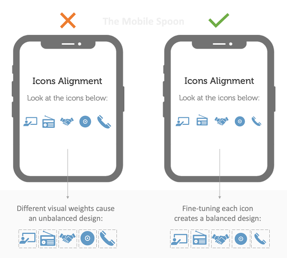
Unaligned Elements
This is one of the most common UI design mistakes in beginners. They overlook this mistake easily while designing. But if you’re an expert you should be worried about it as it’s extremely important. Your elements need to be aligned. Consider grids, they can be helpful in achieving consistent alignment and avoiding this UI design mistake. These elements can be:
•Inconsistent use of color palette for buttons, links header, texts or footer etc.
•Inconsistent font styles of headers
•Inconsistent shape for buttons i.e. some are rounded or some are cornered
•Inconsistent line thickness including dividers etc.
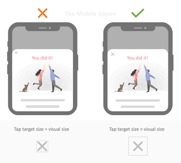
Too small Tap area
It’s also a developer thing but your elements should be big enough for the user to tap on without problems. Apple recommends at least 44px by 44px. Small elements can cause annoyance to the user while pressing or while using the site on a small screen i.e mobile phone. So they should be large enough to be pressed or clicked easily by the user.
No Button Hierarchy
There are places in your design in which you will need to use multiple CTA’s. It’s better to prioritize some of them. It’s the wrong way to highlight or prioritize all of them at the same time in the same row. So you must consider different techniques of highlighting different elements. This will create the neater look of the site and will ultimately help or develop your site. so there should be button hierarchy to avoid this UI design mistake.
Generic Stock Images
Stop using a whatever cute or amazing stock photo you see on the internet. Nowadays we have so many amazing pictures on the internet, you should definitely not use these. To create a more decent design you should follow the more general pattern of using pictures than using a whatever-related image.
Blindly following trends
After seeing thousands of designs on the dribble, we see people follow beautiful trends but they forget about the most important aspect i.e usability of the product. You should consider or understand this aspect that beautiful, heavenly designs will only make your site unrealistic. This beauty can be pleasing to the eyes but it will hinder the usability of the site for the user.
Every app or site requires different techniques of developing or designing to follow, there’s no clear-cut formula that how to pitch the best design. You should make a checklist of all the elements you want to incorporate into your app or site. Above mentioned UI design mistakes are the most common ones, obviously, there are many others, some of them maybe not using the default drop-shadow, a large difference between primary and secondary buttons, lack of text hierarchy, bad iconography, low contrast, confusing forms, poor touch target on mobile or tablet, using irrelevant or poor quality images.
Head to following linked articles in order to get pro tips about UI designing and avoid making further UI design mistakes.
Recap:
So to recap all the above discussion, just consider the following points and try to incorporate these in your developing process so you can avoid those UI design mistakes:
- Align elements using grids
- Make very small elements bigger
- Add hierarchy to buttons and text.
- Use high-quality images and avoid irrelevant photos, consider images of your brand or product
- Value usability over temporary trends
- Use creative and realistic photos
- Create finger-friendly targets by keeping in mind the average adult index finger is 1.6cm to 2cm
- Avoid using color to indicate limited errors instead provide more options to insert correct text
- Avoid creating long forms instead divide the form into different logical sections and show a progress bar to them so they can see at which step they are
- Always use contrast to get user attention for example use dark colors for CTA’s
- Use different colors to make a contrast of different sections on the site i.e for text, header or footer, etc. to avoid color UI design mistake
- Use contrast to differentiate elements from the background for example text on photos can be hard to read so use color contrast in a way that really doesn’t get the effect
- Always align related elements to the same side.
Do you want the Best Budget guide on graphic designing? Click the button below to have a complete insight on that.
So before developing, at least make a checklist of the above-mentioned points so you don’t forget in between. Obviously there are many other UI design mistakes developers make, Let us know in the comment section below that what UI design mistakes you usually make while developing a site or app and how you overcome them.