
1. Use a spacing scale
Choose a base unit, usually 4px or 8px, and allow only multiples of it: 4, 8, 12, 16, 24, 32, 48, 64. Every margin, padding and gap comes from the scale. Decisions get faster because there are fewer of them, and layouts align because everything shares the same rhythm. Tailwind's spacing scale is this idea built into a tool.
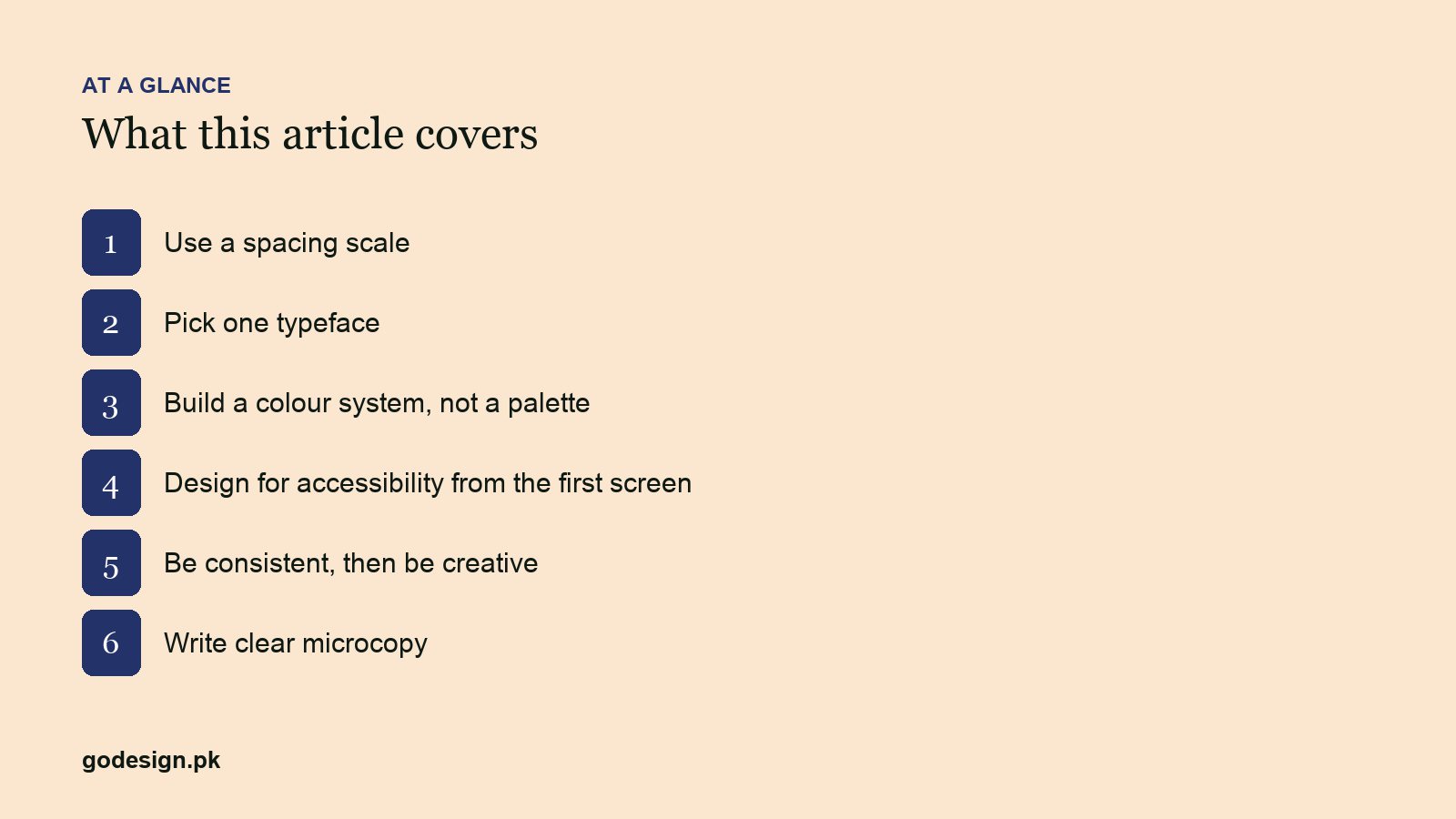
2. Pick one typeface
One family with a few weights covers almost every interface. A second face is justified only for a clear role, such as a serif for editorial headings, which is what this site does with Alegreya and Inter. A third is a mistake. Define a type scale (five to seven sizes) and stick to it.
3. Build a colour system, not a palette
A palette is a list of nice colours. A system says what each one is for: background, surface, text, muted text, border, primary action, danger, success. Name them by role in your tokens (accent, not orange) so a rebrand is a value change, not a redesign. Our note on brand colours covers choosing the hues; this is about assigning them.
4. Design for accessibility from the first screen
Text contrast of at least 4.5:1, tap targets of 44px or larger, visible focus states, labels on every field, no meaning carried by colour alone. Retrofitting accessibility is expensive; starting with it costs nothing. It also improves the product for everyone using a phone in sunlight.
5. Be consistent, then be creative
One primary button style. One card style. One way to show an error. Consistency is what lets users learn the interface once and stop thinking about it. Creativity belongs in the content, the illustration and the moments that deserve attention, not in inventing a new dropdown on page four.
6. Write clear microcopy
Button labels, empty states, error messages, form hints. "Save changes" beats "Submit". "We could not find that email. Check the spelling or create an account" beats "Error 401". Microcopy is design; treat it with the same care as the layout.
Common questions
- What is the best base unit for a spacing scale?
- 8px for most web interfaces, with 4px allowed for fine adjustments inside components. It divides cleanly, matches common screen densities and is what most design systems use.
- Can a product use two typefaces?
- Yes, if each has a distinct role, such as one for headings and one for body text. Two sans-serifs doing the same job is a common mistake that reads as inconsistency.
- Is a design system worth it for a small product?
- A one-page version is worth it for any product with more than a handful of screens. A full documented system pays off once more than one person is designing or building.