
Creating a brand color is the most important aspect of any business. You must have a clear idea and vision about who you’re, what you’re marketing, and to whom your marketing. You must have a perfect understanding of yourself and your customers. For this purpose business owners invest their time, energy, and money in designing logos and websites so they can have a good impact on the market.
But it’s only one aspect, there are also other factors that need to be kept in mind while creating any brand, that is the Brand Color; the psychology of different colors, what they mean and represent in different contexts. However color is also subjective to the viewer’s opinion and his personal experience that what he thinks about that color, what beliefs associated with it.
Why does color matter?
So the first step is the color you have chosen for your brand, what is its meaning and how this color will influence the people and how it will define your product.
Meaning of colors also subjected to cultural beliefs. For example in America black cats are considered as a symbol of bad luck but in Japan black color or black cats are considered as a sign of good luck.
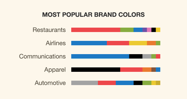
Brand Color can also change its meaning depending on its industry. For instance Restaurants, Airlines, communication, appeal and automotive, etc. They all follow different color pallets and have their own unique color schemes that can’t be replaced by others. Red color often represents anger and passion, so different brands often prefer to use this color in order to excite their audience, e.g Coca Cola. Similarly, if your product is something relaxing supplements you will choose the colors which cast relaxing feels on the viewers e.g pastel color or colors with an earthy tone.
Statistically, gender also drives unique behavior with colors. Let’s say pink is associated with women and if a man likes dark sea green; he’s dense in nature and personality. Different aspects of personality are associated with colors and these vary from person to person. Depending on the viewer’s experience and the situation, the meaning of the color can change. The color meaning is the conjunction of the situational context and the viewer’s experience.
Visit the linked article below to know amazing tools for custom color palette.
Effect of your brand color on Audience:
As described earlier, different colors have different connotations attached to them. Let’s discuss the colors in detail so you have a clear idea of what color defines your brand.
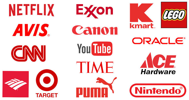
Red
Red color defines passion, love, anger, and excitement. Different brands incorporate this color in their brands in order to avoid the sense of urgency and excitement.
Orange
Orange explains the feelings of optimism and happiness. Brands use this color so they can be more approachable and friendly. Brands associated with children’s products commonly make use of this color. GoDesign is the best example.

Yellow
Feelings linked with this color are happiness, optimism, craziness and instability. Brands love to use this color in order to get warm feelings towards their products.

Green
Green is the color of nature and it highlights the feelings of calmness and serenity. This color cause-effect of calmness and health on its consumers. Brands associated with medicines and supplements often use this color.

Blue
Blue is another most important color of nature. It defines serenity, confidence, and calm. Different brands use this color in their branding in order to get customer’s confidence and trust.

To get deeper insight of the color’s psychology, checkout our post below.
How to choose right color Palette for your brand
In order to choose the exact perfect color for your brand, you must consider the following questions in your mind so you can come up with the “color” of your brand.
What color will give you an advantage over competitors?
This is the most important question while choosing the color. To answer this question, you will first define your audience, who’s gonna view your product, keep your target audience in your mind. For example, if your target customers are aged men and your product somewhat belongs to them then you must consider the colors which affect or soothe the old men’s eyes i.e light earthy colors. Similarly, if your brand is focusing on children’s products or toddlers then you must go for a sharp color palette.
What cultural data do you have that will support your color choice?
As explained earlier that different colors have different cultural connotations attached to them so you must keep in mind that what product you’re offering in which region. For example, if you’re someone based in Japan then you must incorporate more black color in your branding because it’s associated with good luck in that region. Clearly and deeply think about that who are you and to whom you’re selling. After this bridge, these two things together to create your own unique color palette. Once you succeed in selecting the primary color of your brand, start focusing on complementary colors that you can incorporate with that primary color defining your brand.
What’s the age and gender of your target audience?
To answer this question, have a clear idea about the psychology of gender in relation to colors. For example, if your brand is selling women’s products then you should consider a more pinkish brand color palette. Likewise if you’re selling active wear for young men then you must add colors accentuating energy and activeness e.g more blues and oranges.
What’s the interests and behaviors of your audience?
The color you choose as your brand color defines that who you’re as a brand and who are your target customers. Your colors deeply affect the audience and explain that how they will interact with you and your brand. Try to choose the colors which cast a good effect on your customer’s psyche and make him buy your product.
So colors are everything, from your brand’s definition to your Brand’s marketing. Having their complete understanding is the most important aspect of developing your brand. Beware of the trends that circulating in the world of marketing; have your own unique color palette which can define your brand like a pro.