

1. Overdesigning
Gradients on gradients, three animations per section, decorative shapes behind text. Every element competes, so nothing wins. The fix is subtraction: remove until the page still works, then stop. The most effective interfaces have one thing to look at per screen.
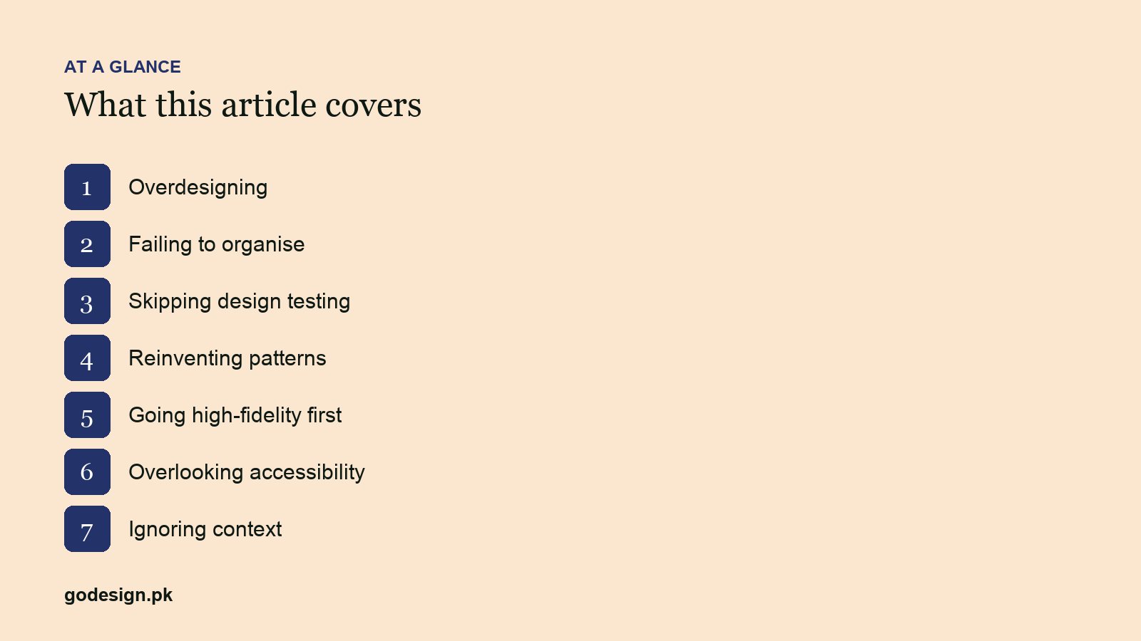
2. Failing to organise
Information in the order the company thinks about it rather than the order the visitor needs it. Services listed by department, pricing hidden behind a contact form, the phone number in the footer only. Fix: write the visitor's questions in order, then lay the page out to answer them in that order.
3. Skipping design testing
Shipping a layout because the team liked it. Five people from outside the project, given a task and watched for ten minutes, find most of the problems a full usability study would. We do this on the Figma prototype before development, which is where it is cheap to change.
4. Reinventing patterns
A new kind of menu, a novel date picker, a custom scroll. Users have learned how the web works; every invention makes them learn again. Use the established pattern unless you can name the problem it fails to solve.
5. Going high-fidelity first
Opening Figma with fonts and colours before the structure is agreed. Stakeholders then argue about the blue while the layout problem goes unnoticed. Wireframe first, get the structure signed off, then apply the visual design. The UX process piece sets out the order.
6. Overlooking accessibility
Light grey text on white, links that only change colour, forms without labels, sliders that need a mouse. Roughly one in six people has some disability affecting how they use the web, and everyone hits low contrast on a phone outdoors. Contrast checkers and keyboard testing take minutes.
7. Ignoring context
Designing on a 27-inch monitor for people who will visit on a phone, on a slow connection, in a hurry. Most visitors to a Pakistani business site arrive on mobile. Design the phone view first, check it on a real device over mobile data, and treat the desktop version as the expansion.
Common questions
- How do I know if my website has UI problems?
- Watch three people who have never seen it try to complete a real task, such as requesting a quote. If they hesitate, scroll back, or ask where something is, that is a UI problem. Analytics will show the same as high exit rates on those pages.
- Is mobile-first design still necessary?
- More than ever. Mobile is the majority of traffic for most business sites and Google indexes the mobile version. Designing desktop first and shrinking it produces the cramped mobile sites this article is about.
- What is the cheapest fix for a poorly performing site?
- Usually reorganising the existing content: clearer headings, the main action above the fold, contact details visible, and fewer competing elements. Often that beats a full redesign for a fraction of the cost.