UI/UX Terminology is what every designer should know in order to communicate with other designers and to stand in the field. It is quite obvious that if you get into any designing studio you will be communicating with other designers and this is for what you will be using UI/UX terminology.
GoDesign always tries to keep updated its viewers by providing the latest information, trends, and many more. So this time our top-notch designers have made a list of 10 terms every designer must know. This list of UX/UI terminology will not only help you to communicate effectively with other designers but also improve your written communication with other designing firms.
Here is the list of UX/UI terminology you must know.
1. Breadcrumbs
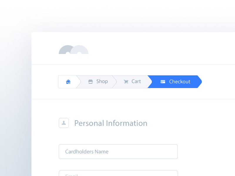
In UX/UI terminology, it’s an element used as a navigational aid. It allows users to keep track and maintain awareness of their location within websites or software. It’s a best practice to make the parents clickable so the users can use it to navigate too. The term is a reference to the trail of bread crumbs left by Hansel and Gretel in the German fairy tale of the same name.
2. 60-30-10 Rule
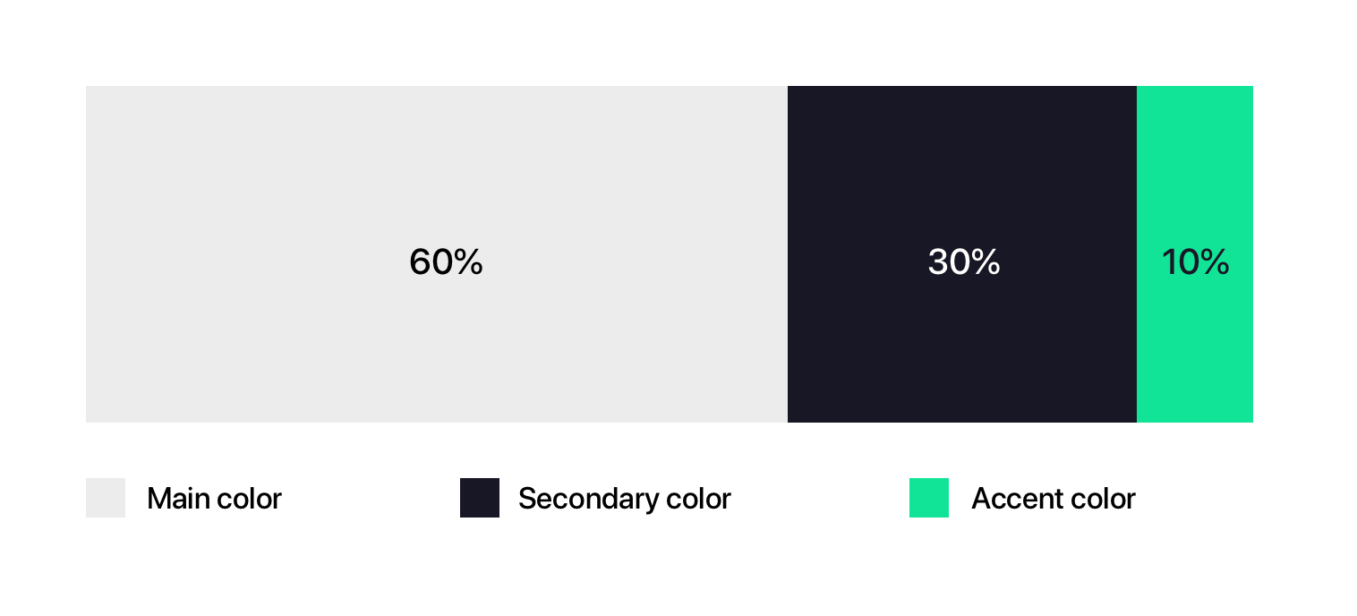
This is another UX/UI terminology and isn’t so specific for UI but a simple design rule you can apply when choosing the colors of the elements and help to create a correct balance. You’ll have 60% of your dominant color, 30% for your secondary color, and 10% for the accent color. This rule is often applied to interior designing.
3. Vertical rhythm
This UX/UI terminology refers to a repeated pattern used to keep vertical spaces between elements on an interface consistent with each other. Applying it to our designs creates familiar and predictable experiences and visually pleasant user interfaces. 8pt grid to space the height of the elements is GoDesign’s favorite to start creating vertical rhythm.

4. Padding
It’s the space surrounding an element’s content on an interface. All the designers out there; don’t confuse it with the margin: the padding is inside, and the margin is outside the border. Always keep this in mind when you need to ask the developer to adjust the spacing. So this is an important UX/UI terminology you need to be aware of.

5. Wizard
The pattern consists of a linear sequence of steps to complete a task. It’s used when are required too many actions or really looking ng forms, helping to divide this into smaller blocks (staged disclosure). You must consider the caution that it can become very complicated if there are related steps and the user has to switch between them.

6. Stepper
The function of this UX/UI terminology is to help the user to orientate himself during the execution of various tasks (e.g in a wizard). Important pointers which need to be highlighted explaining this UX/UI terminology are:
- Actual Position
- Total number of steps ( be transparent)
- Steps completed
- Steps to be completed
7. Wireframe
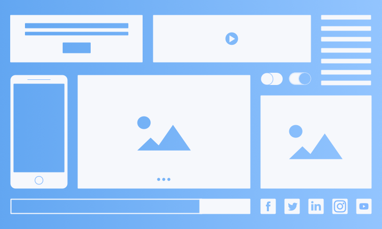
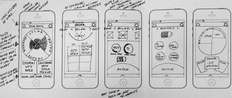
It can be explained as the view of a sketch of all the information on page. It is also called as the blue print or road map of all the important information you are viewing. It is considered as the backbone of any design and while making all the elements should be kept in mind so nothing got missed while making the actual design.
8. Mockup
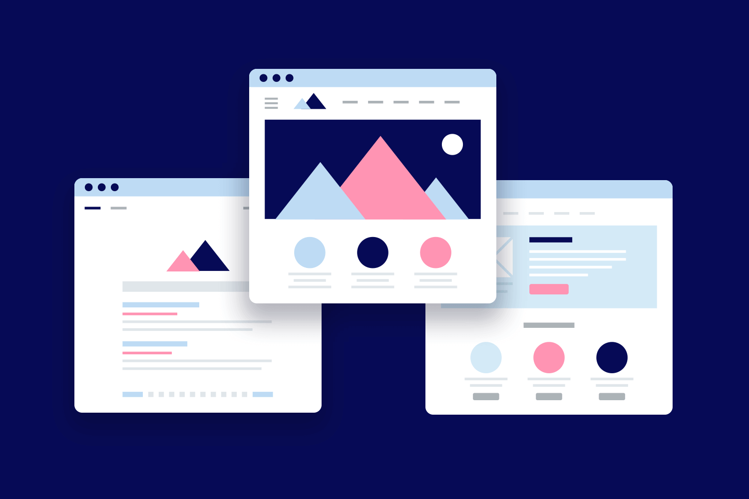
Mockup refers to the static representation of any design. It’s highly detailed with all the important information. A good mockup defines the structure, information, content, and all the basic functionality of the design in a static view. Mockups are the easy way to find out that what’s gonna be the end product. The time utilized in making mockups is less than those of prototypes. This is the most important UX/UI terminology every designer must aware of.
Click the button below in order to know about Mock websites.
9. Prototype
This UX/UI terminology often gets confused with a wireframe. It can be defined as the high detail representation of the final product. It aids in user interaction with the interface and allows the user to rate the content and interface in sense of its functionality. The prototype should not exactly look like the end product but it also shouldn’t be sketched all in gray color. It must be the imitation of the final product.
Want to know more about these terms? Head to the linked Articles.

10. Color Wheel
The circle in the picture below shows the relationship between primary colors, secondary colors, and tertiary colors. Artists and designers use red, yellow, and blue arranged at the equal space on the wheel. This color wheel helps them to select their design’s color.
11. Golden Ratio
It is a mathematical ratio that has its origin in Greece. It also called the Greek letter Phi. It’s an element of nature but designers incorporated it into designs because they found it appealing to the human eye. This Golden ratio approximately equals 1.618. We can find it when we divide the line into two equal parts. So that the full length divided by longer parts is equal to longer parts divided by the shorter ones.
12. Accessibility
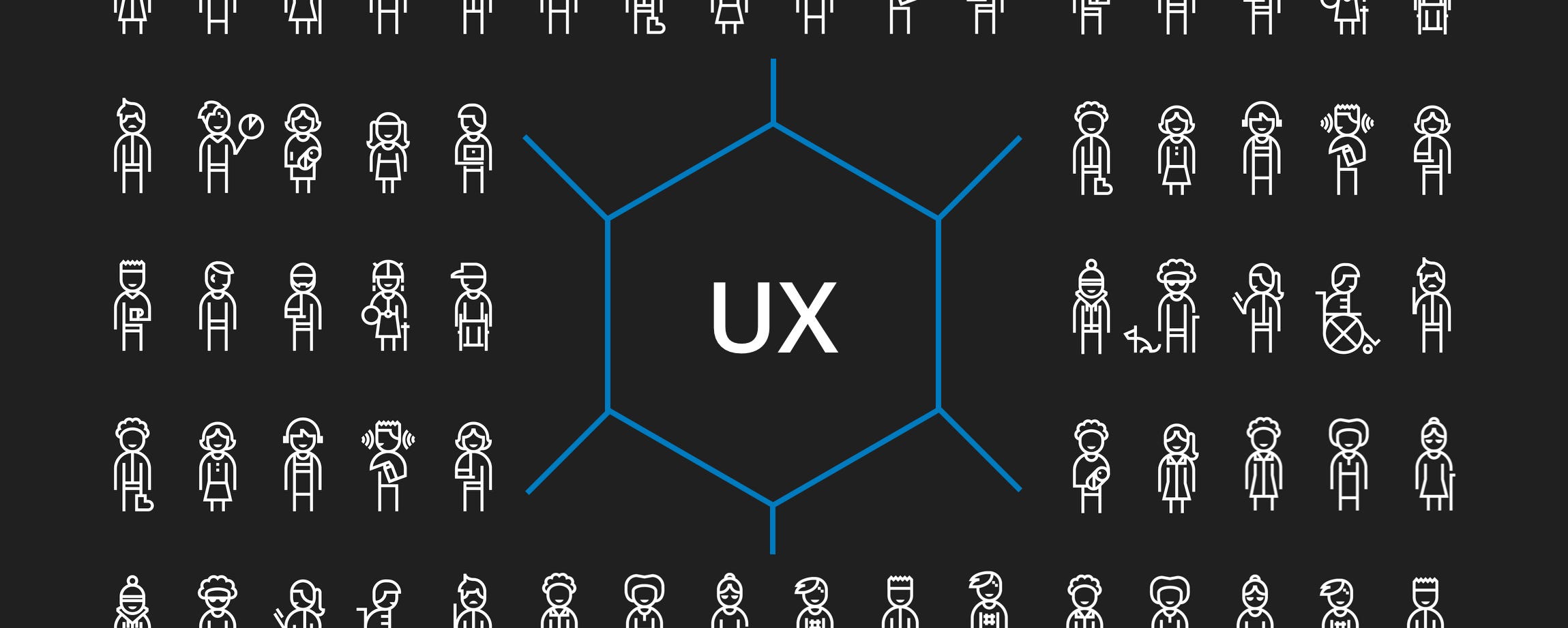
This UX/UI terminology can be described as that how much a web page is user-friendly, is it accessible to every person or not? Can it be used by a person with disabilities? It’s the most important part of UX/UI designing. Every designer must be vigilant about this important feature while designing.
13. 80/20 rule
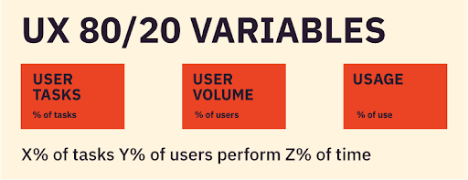
This rule says that 20% of the functionality in any environment is responsible for 80% of the actions taken in that environment. This is also called the Pareto principle and is applicable to any web page, software or application.
Head to the Following linked article in order to know more about UX/UI designing tools.
So above terms were terms compiled by us. Use this list as a checklist and try to search more about the mentioned terms and explore your learning with us. Do you already know about these terms? Or know more? Let us know in the comment section below. And don’t forget to Like. Share and Subscribe.

