For UX designing, in this modern world of AI and “Human-Centered Machine Learning”, it becomes very important for UX designers to learn the psyche and the needs of their users. In order to have a clear idea of the needs of users, designers must know some basic principles of psychology. So for this reason GoDesign is here to help you understand these.
Let’s consider the set of Gestalt principles, these principles were proposed in order to make a clear sense of how people perceive the world, and the Principle of Proximity was one of them, which was proposed by Max Wertheimer in the early 20th century. According to this theory, “When objects are closer to each other they tend to be perceived together in one group”. Basically, this proximity can be defined as closeness. If designers choose to use a clear structure and visual hierarchy in their UX designing process, it would be easy for the user to navigate and react.
Following are the few points of proximity you must consider while UX designing:
Group the correct elements together
Proximity in UX designing is considered one of the important aspects of a grouping of elements. This practice of placing similar elements together and unrelated ones separately is the key to UX design. You can use whitespace in order to separate the elements or units and it is the key to communicating meaningful grouping.
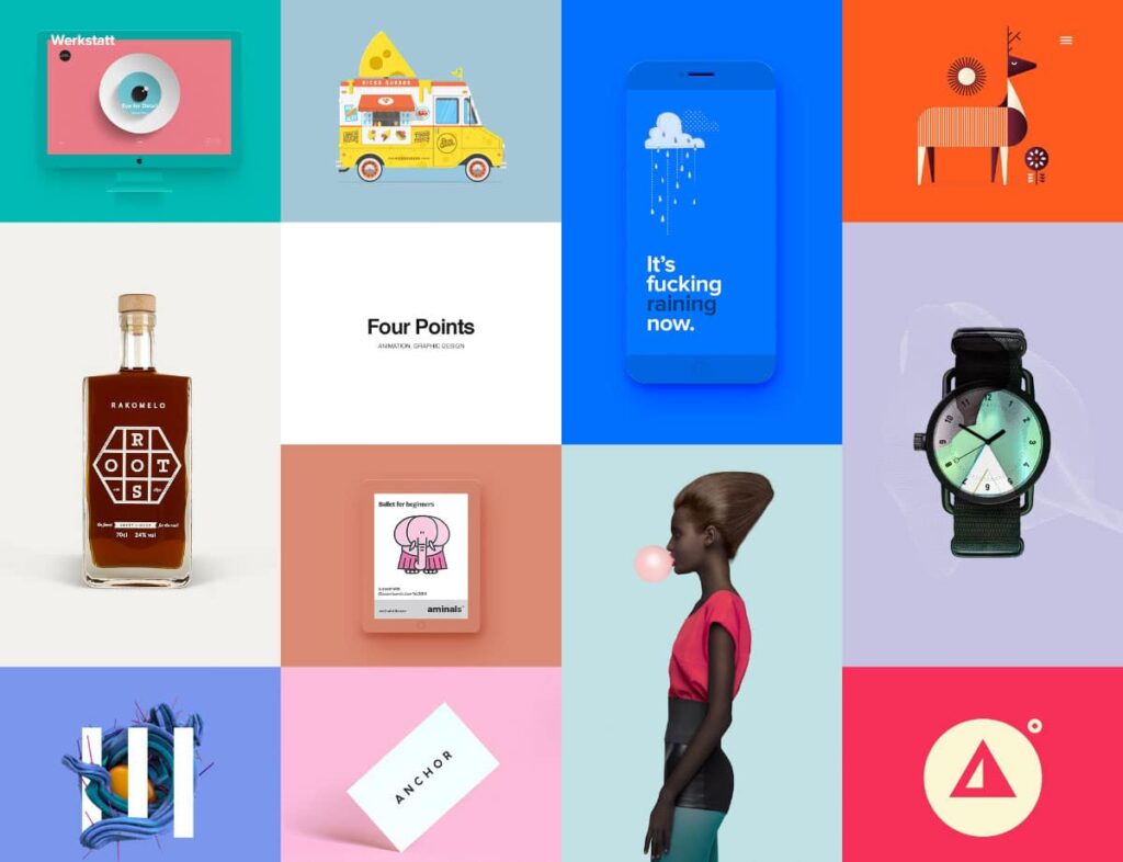
Use different background colors to separate individual elements
In UX designing it is necessary to use such colors that can help the viewer and a user to navigate and differentiate through the site easily. You must consider different colors for the background and the elements. For example, if you’re using light color in the background then you should use brighter and dark colors for the icons and the elements. This will not only ease the user but also give eye-pleasing look to your site.
Use white space to separate different sections
White spacing is the key element of communicating meaningful separation between different elements. You can use this white space to separate your text from the elements. It can be helpful in the separation and grouping of elements. For example, if your site has similar elements having similar shapes then you must differentiate both elements by using white space.
Head to the following linked article to know more about free UX design tools.
So in a conclusion, placing related elements in proximity and using white spacing cause user to find and react easily. When a user visits the site, he wants his needs to be accessed quickly so making these grouping allows him to find what he needs more quickly and effectively.
If you are a UX designer then you must learn your customer or viewer psychology in order to know better about their needs and what they are looking for. Understanding this helps that how they will react to your offerings. Learning human behavior and psychology helps the designer to design a better, user-friendly website by knowing the limitations and abilities of the human mind. Consider following point in UX designing:
- Apply the factors highlighting human cognitive behavior and human interaction with computers in UX designing.
- Try to learn and explain usability guidelines in order to anticipate the impact of designing on the user.
- Learn how you can get their attention.
- Consider learning visual perception in UX designing.
- Incorporate the factor of memory and knowledge.
- Must know the strategies for information retrieval.
- Learn and must have a knowledge of Mental models for predicting.
- Must have an idea about the language usage.
- If you’re a UX designer then you must keep in mind the aspect of aesthetics and its relation to the human mind.
Click the button below to avoid making mistakes in UX designing.