The Right Brand Colors
There is no doubt that most of the image of any company is created through its visual dimensions. When we study the language of the advertisement, then there is a key role of Colors used in branding these advertisements. So, we can say that the part and parcel of any visual representation of any company is the use of the best brand colors.

When a color is chosen by a specific company then comes the key feature of the branding. The use of certain colors surely affects the ways people that how they perceive the certain image of the brand. So, brand colors are used for making people think in a certain way about the company through the brand colors.
Most of the people contact the company through the company’s logo. So, we can say that this first contact of the client is through the brand colors which are used in the company’s logo. The basic thing about logo designing is the use of certain brand colors which can inspire the viewers to think in a particular way that is the basic way of the company to be perceived.
What is the basic idea of choosing the brand colors by the brands?
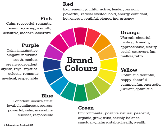
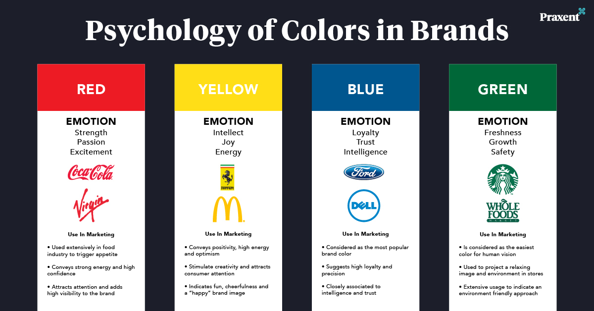
The basic idea behind the brand colors is that the company wants to convey a certain message to potential clients. This basic message cannot be conveyed without the use of certain brand colors. The use of colors is based on Color Psychology. Color Psychology is the way of extracting certain meanings from certain colors.

The examples of colors include: blue color is commonly perceived as a calm and relaxing color, and red is being perceived as energetic, dangerous, and exciting. Some colors also represent feminine qualities and one of them is Pink color which is recognized as a feminine and fun color. The idea about the “White” color is that it is used for purity.
The basic Steps of Choosing the Brand Colors
The underlying idea about anything is that we should start it from the basic level. The same is the case with the Brand colors. If you want to start from the basic level, then you need to start by picking a primary color that can represent your brand effectively. If there is any other need of choosing the colors, then you can select the “Secondary or Tertiary” Colors.
The best idea to promote the brand’s image is that you should not use such colors which can confuse people or convolute your brand image. The basic questions about the use of the brand colors include:
- What type of company?
- Do you want youthful brand that appeals to the young people?
- Is there any idea of sports brand for women?
In the end of selecting the brand colors the part and parcel is that the type of the brand is directly influenced by the colors you choose.
How to Achieve Brand Recognition?
Habitualization makes people think about something in the already perceived way. When the customers become familiar with the brand colors then they begin to think about the company’s image in an already perceived way. So the basic thing about this is to remain consistent with the basic colors and to use them consistently. If you get on switching the brand colors then the customers might get confused. So be specific and consistent.
Therefore, from the above discussion, it is clear that most famous brands always remain consistent with their logo and brand colors. They know that if they get on changing the brand colors and logo designs then it will directly influence their business. The below-described brand colors are chosen correctly and they represent the image of the brand in an active manner.
1) Apple

There is no doubt that Apple’s brand colors have always been very fluid. There are always varieties of colors popping up on their products throughout the whole year. The recent brand logo is in either black, white, or silver. The use of such style in Apple’s brand is basically a departure from the original rainbow coloration.
The idea about such logos is that these colors are neutral and can be interpreted as being representative of clarity and quality. We have told above that “White” color is for purity, and black color create a sophisticated look of Apple’s product design.
2) Google
It is an exception to the unwritten rule that says if you have a lot of brand colors then it can harm or damage your brand image and brand recognition. The Primary colors are used mostly in the “Google Logo”, and the only Green color is used in the letter “L” which serves the purpose of being away from the primary colors. Once a designer, Ruth Kedar, said, “Google does not follow the rules”.
3) Coca-Cola

The origin of the brand Coca-Cola is in practicality than anything else. In the initial stage, the barrels containing Coca-Cola were painted red because the text agents could be able to distinguish them from alcohol during transport. There is no doubt that Red Branding was so effective that it helped to shape the image of the modern-day Santa Claus. In 1931, there was the beginning of placing ads in popular magazines and commissioned artist Haddon Sundblom who was to create a new version of St.Nick. After this, the new design became very popular and the universe accepted the depiction of Santa.
4) Microsoft

The basic brand colors of Microsoft include orange, red, green, blue and yellow. There are different uses of the colors in different products by Microsoft such as Microsoft Office, XBox and Windows. The colors which are shown together in combination on Microsoft’s latest logo were revealed in 2012.
5) Amazon
I hope that there is nobody who does not know about Amazon. The dominant color in the Amazon logo is Black and we have already told that the Black color is refined, elegant and professional. There is an accompanying color which is Yellow which is used in it as a welcoming color. The function of the black color is to emphasize the text in Amazon’s logo, while the Yellow streak represents Amazon’s effort to make the customers happy and adds lightness to the design. There are some other brands that use this combination of colors.

